Koalafi
Improving the user flows of a financial services app
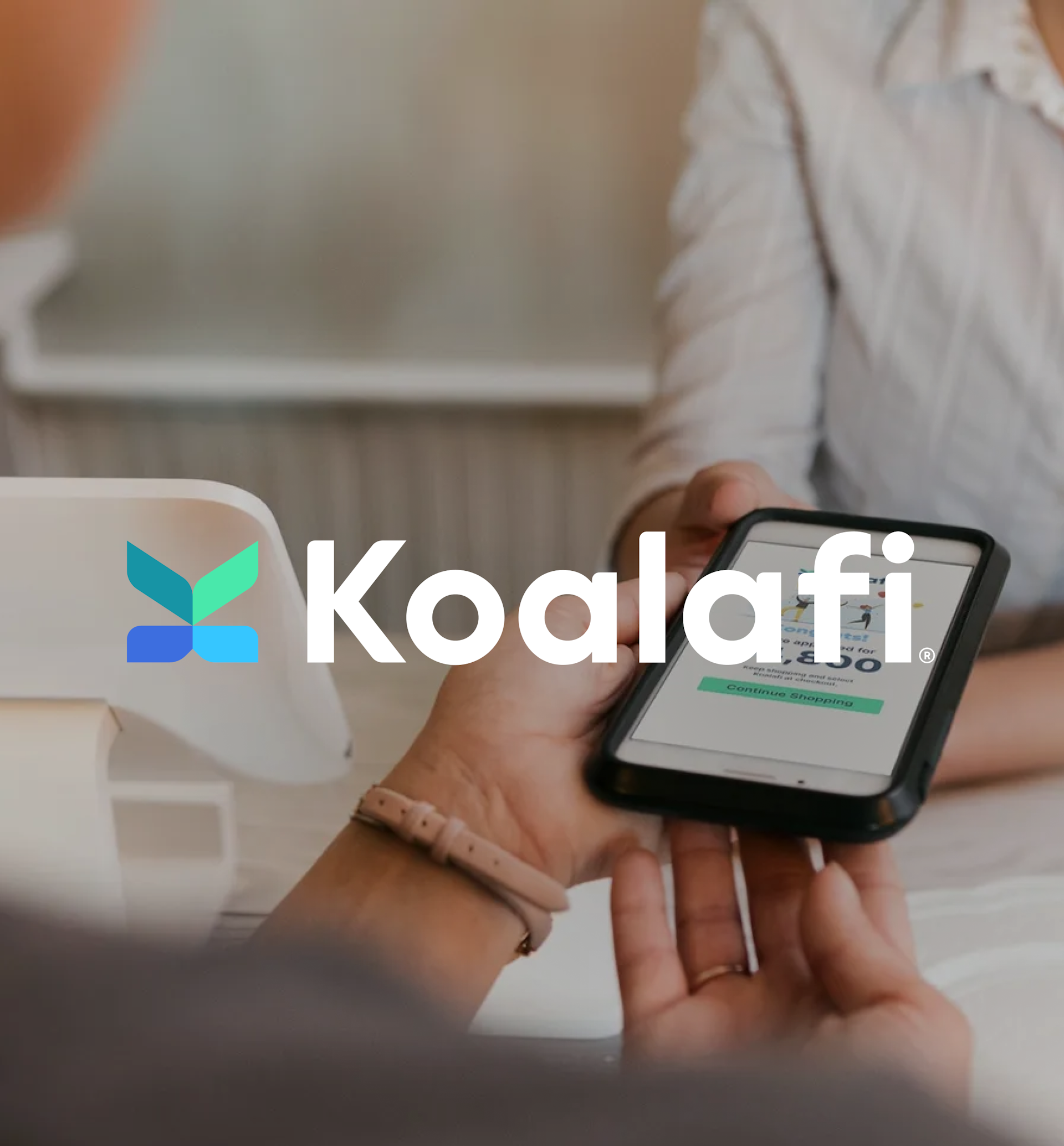
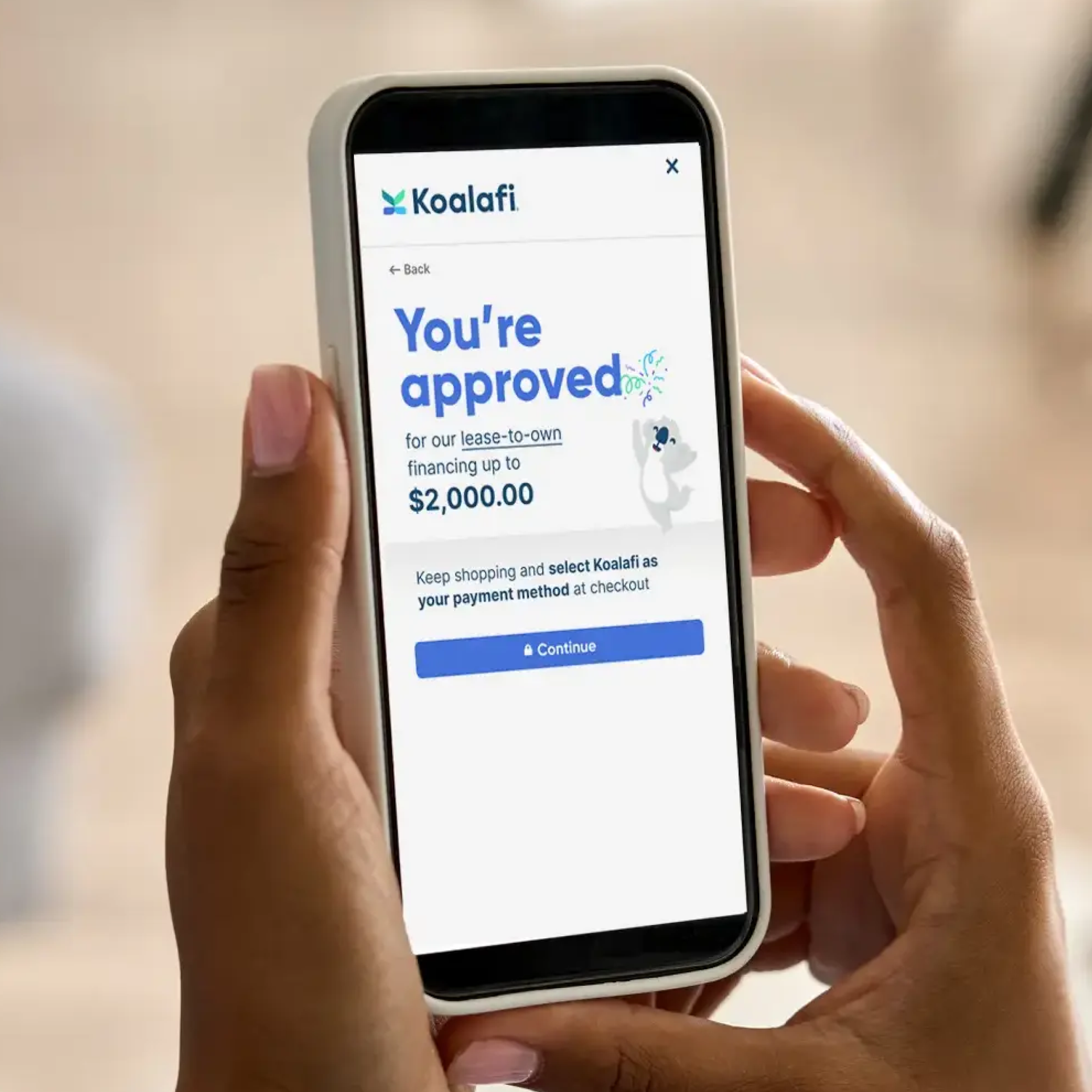
Consumer financing options are complicated — for both the customer and the merchant. When applying for financing, many customers, faced with too many applications or steps, are told “no” or simply give up. On the other end, merchants often have to sort through multiple systems, keeping them from serving customers and making more sales. That’s where Koalafi steps in. The financing platform offers both loan and lease-to-own financing to instantly match customers with the product that best meets their needs, simplifying their checking and financing experiences. For its partners, Koalafi’s platform enables them to reach new audiences, increase conversions, and save time.
Before teaming up with Big Human, Koalafi underwent a rebranding and renaming process to better reflect its identity as a modern, user-centric fintech company. Formerly West Creek, Koalafi then came to us for a user-first application redesign.
- Strategy
- Product Design
- UX/UI Design

Strategy
Solving for two different tasks
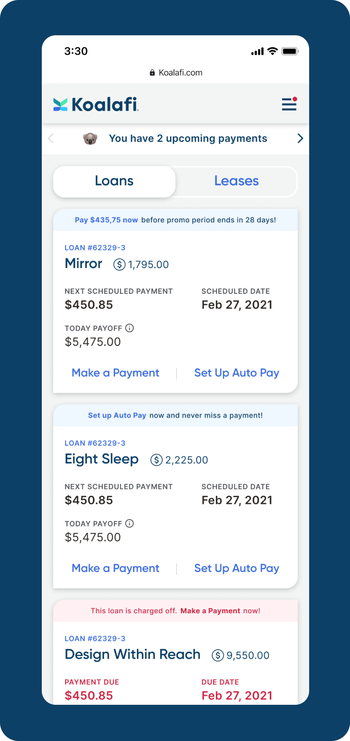
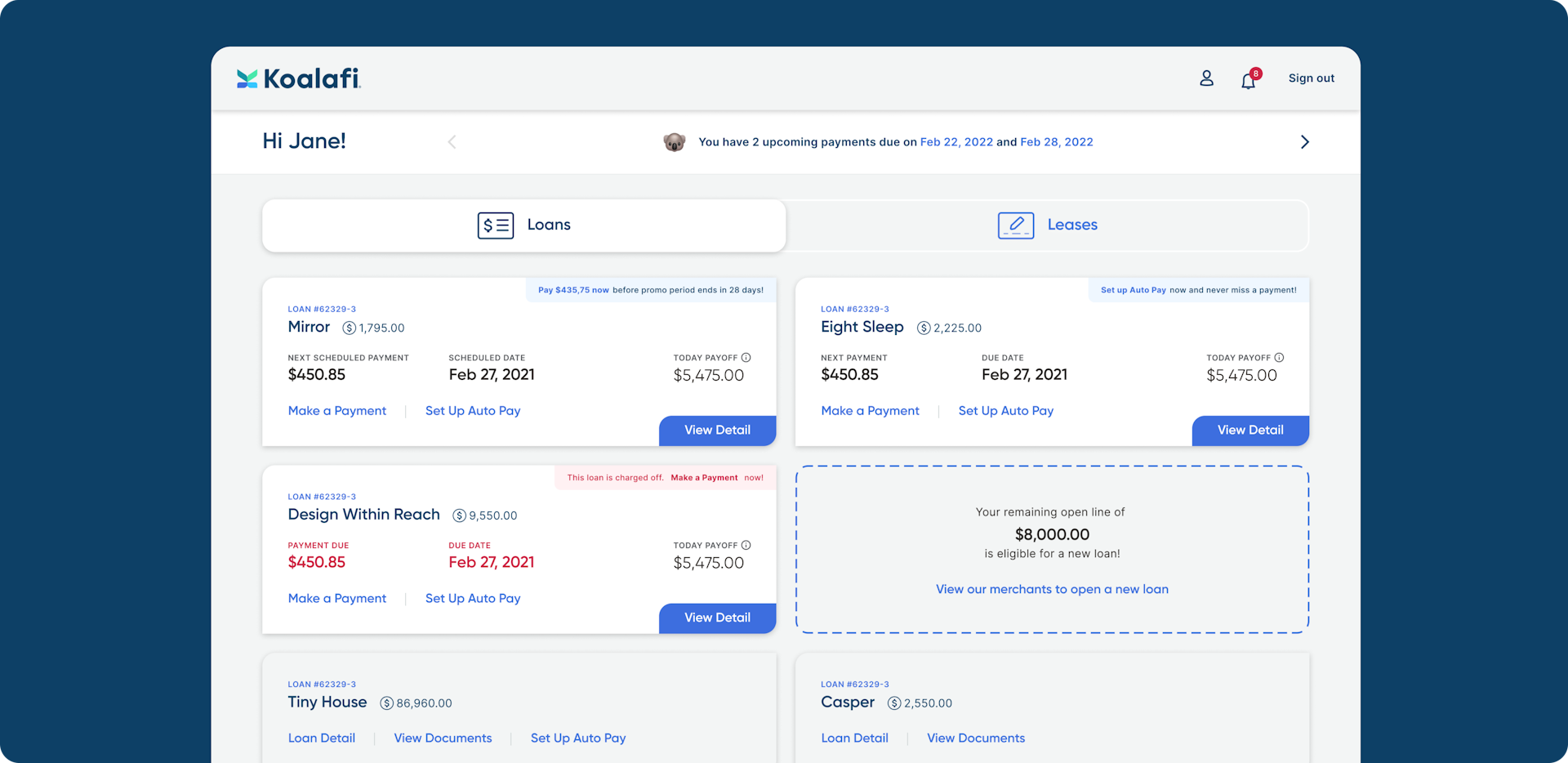
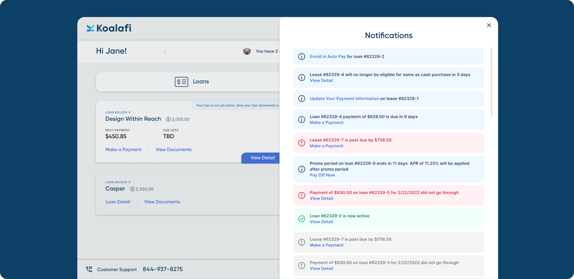
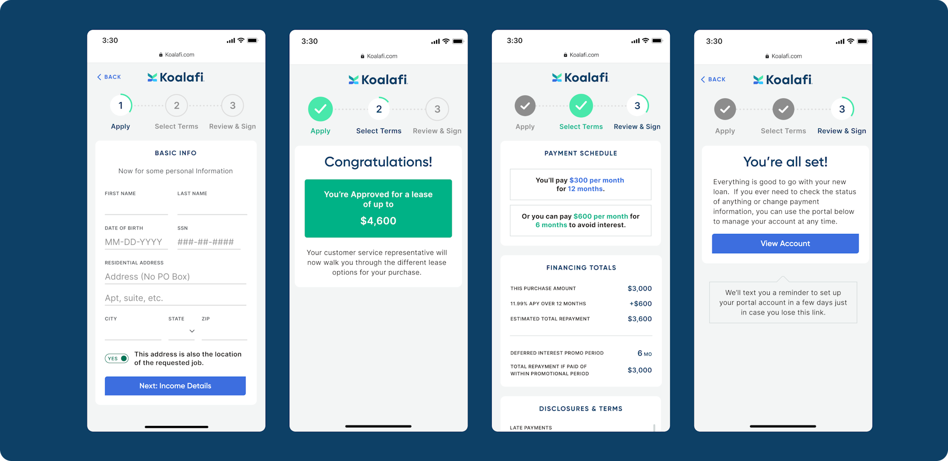
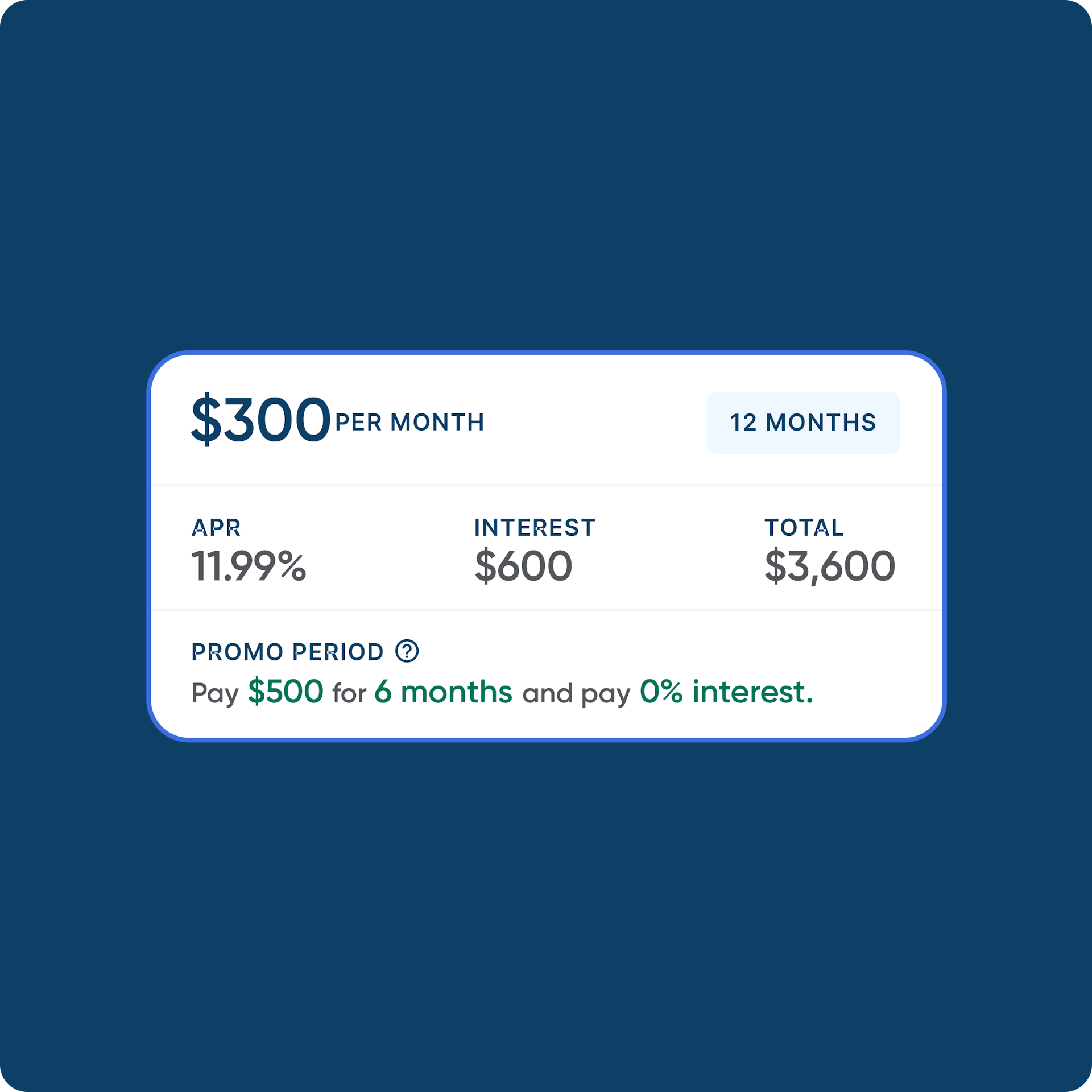
As with all Big Human projects, we began by learning more about our client and the services it provides. After several stakeholder interviews and collaborative workshops, we identified two challenges. The first was information density; there’s important information for the customer to consider when choosing between financing options, and it’s difficult to fit it all on a small screen. The second was the individual experiences that make up Koalafi’s platform: its consumer financing application portal and merchant portal. With these interconnected data streams, we had to analyze how these setups spoke to each other and conveyed information.
To make sure we gave both of these challenges the attention they deserved, we split them into two different projects. Since Koalafi’s top priority was to update its application with the new branding, the first sprint focused on reskinning the platform with UX/UI tweaks. The second was a deeper restructuring of the application that optimized content and user flows. As a more exploratory concept, this part of the project was treated as a way to show Koalafi how it could iterate on its user experience in the future.
Visual Design
Reskinning the entire platform
With a new name and look, Koalafi’s financial services platform also needed to reflect the evolved identity. Big Human designers worked on applying Koalafi’s updated branding to every page and element on the platform. We looked at it as if we were painting, refreshing colors, fonts, spacing, and more. Since we needed to work fast, we focused on making design updates that would have the greatest visual impact with the least amount of code and structural changes.


Product Design
Redesigning the information architecture
Nimbly reskinning the platform allowed the Big Human team to put more time and effort into the second half of the project. We saw it as a clean slate, giving Koalafi options for an enhanced user experience its team could later explore.
We knew we had to account for various user and information flows, so we started with reconfiguring Koalafi’s wireframes and information architecture on the financing application and user portals. With rich content and resources for both consumers and merchants to sort through, we condensed the information hierarchy to include the most important details first.
By the end of the project, Koalafi walked away with new designs for its servicing portal, merchant portal, financing application, email templates, global styles, and components — a perfect starting point for its team to test, iterate, and build upon in the future.
Results
Accounting for the future
Koalafi’s reskinned financial services platform now adheres to new brand standards and requires little lift from development. Big Human’s product redesign accounts for more long-term improvements to the information architecture, user journey, and overall user experience.